Duration: January 2022 - March 2022
Type: Nonprofit, Website Design
My Role: UX & Visual Designer
curaJOY
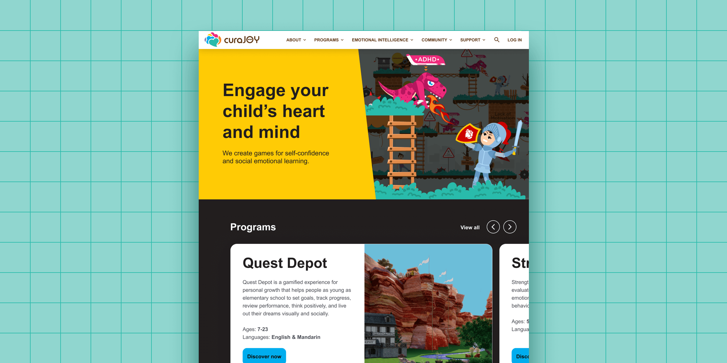
Website Design: curaJOY is nonprofit that creates interactive games to help kids grow in self-confidence and social emotional learning.
Problem: curaJOY’s existing corporate website communicated a strong mission statement, but needed improvement in brand consistency, visual design, and accessibility.
Goal: Create responsive redesigns for five core pages (Home, About, Emotional Intelligence, Quest Depot, Donate).
User Persona
Our UX researcher Chloe based this persona on several interviews on usability of current site.
As a busy parent, Stephanie wants to find a fun, family activity that improves her kids’ social and emotional skills so that she can help them thrive in life.
Competitive Audit
I learned curaJOY could benefit from a bold and memorable visual identity.
Also, compared to a direct competitor, curaJOY had an opportunity to celebrate its culture of diversity and inclusion.
Website Audit
To get things rolling, I created a Figjam file to collaborate with other UX designers on finding different ways to improve the existing site.
Sketches
In paper wireframes, I explored several ideas before refining them for each page.
Figma Wireframes
I designed responsive wireframes where I received valuable feedback from a team of UX designers and Caitlyn - the nonprofit’s founder.
I learned more about Caitlyn’s visual preferences, and ways to prioritize, group, and remove redundant sections from Dulguun - the UX lead.
Style Guide
Expanded existing corporate style guide, for website.
Components
Here are some of the components frequently used for desktop.
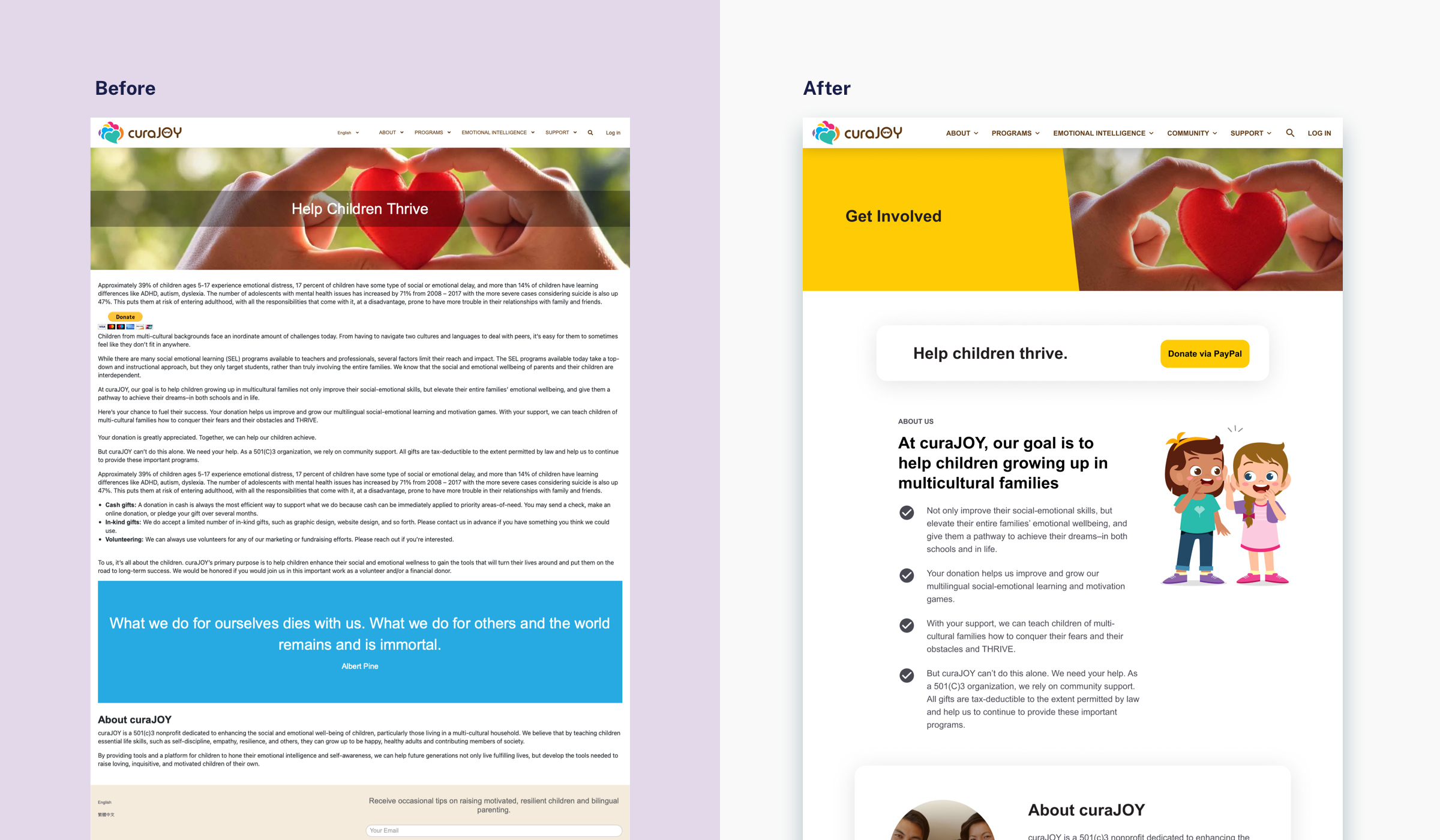
Mockups: Before & After
Shows how consistent typography, colors, buttons, illustration styles, negative space, and accessibility makes a positive difference.


Accessibility Considerations
-
Images
Incorporates inclusive and diverse representation of curaJOY team members, users, and volunteers.
-
Color Contrast
All text and icons meet WCAG standards, by passing AA.
-
Font Size
Larger font size (body text at 19pt) increases readability for people with varying sight abilities.
High-Fidelity Prototype
Final hi-fi prototype shows a clearer navigation and more flexible user flow.
Users can now find priority pages with ease, be assured the site will remember their choices, and take alternative paths.
What They Had To Say
Jennifer is very talented at what she does. She's resourceful, dependable, and proactive, and delivered a great website re-design to us on schedule. We're lucky to have found her.
- Caitlyn W., Chief Joymaker at curaJOY
Takeaways
What I Learned: Through this project, I learned to collaborate remotely with the founder, UX lead, UX designers, and content writer.
Next steps: Would like to implement redesign to the website, by setting global styles on their Wordpress, and using visual editor, Stackable plugin, and reusable blocks.


